
The cliché warns you should not judge a book by its cover. But can you judge a cover through what you already know about a book? That is what Judy Golding, William Golding's daughter and author in her own right, Eleanor Crow, senior designer at Faber, graphic artist Neil Gower and Kate Abbott, art and design editor at the Guardian, were about to find out.
Their task was to judge a competition inviting artists, between the ages of 13 and 16, to design a cover for a new educational edition of Lord of the Flies (the winner would work alongside the Faber design team and see his or her cover through production). The judges were also to choose a further 20 covers to exhibit at the Guardian's King's Place headquarters.
From the start, there was an obvious – and exciting – problem. There had been 270 entries and the standard was tremendous – dauntingly professional. It was easy to imagine many covers convincingly wrapped around the novel. As Judy Golding confided on the way up to Faber's offices, the task ahead appeared impossible.
The plan was for each judge to choose a short list (though "short" turned out not to be the word). But Judgement Morning began with general thoughts. Eleanor Crow volunteered: "What we are after is an arresting design to pull people in and interpret the book." Neil Gower – who has designed several Golding covers – said: "It must have impact and intrigue." Judy Golding was looking for "originality" and Kate Abbott "an imaginative eye for detail and design".
There was little overlap between shortlists – a testament to quality and range and a reminder of the subjectivity of choosing. There were paintings, water-colours, pencilled sketches, photographs. Many images went straight to the heart of Golding's 1954 novel about boys on a desert island who try, with catastrophic consequences, to govern themselves and murder a bespectacled boy named Piggy. The story is such a classic that the judges' needed to remember that the cover must also stop new readers in their tracks
Inevitably, the novel's symbols – conches, pigs and spectacles – recurred. A particularly fetching pig, by 13-year-old Amrita Robertson, with an intricate black-and-scarlet indonesian pattern embracing conch and flame, was generally admired. But early on, it was clear there was a split between clear, explanatory images and oblique explorations.
Eleanor pointed out 14-year-old Ned Prizeman's island: "It is a conventional watercolour about being let loose on a desert island where you don't realise how dark it is going to get." Neil qualified this by identifying a chaotic quality – contorted palms, smoke signals from its summit. Fourteen-year-old James Laszcz's drawing of a hand holding a conch, conventional too, was also praised for its draughtsmanship and Eleanor approved of the "slight revulsion with which the conch is held".
There were plenty of covers at the opposite extreme such as 13-year-old Laurel Constanti Crosby's splendid, innovative photograph of a palm leaf with black and white tribal stripes superimposed. The judges also lingered over 13-year-old Ranya Zerrouki's dramatic black and white photograph of a headless boy in a dirty vest, stick in hand: the embodiment of intention. And they all were arrested by the power of 16-year-old Ellie Scorah's "Painted Face" with its implacable eyes. Judy Golding was also bowled over by 14-year-old Avinda Cabandugama's "Dancing round the fire" and its ambivalence: "You don't know whether the figure is bad or good."
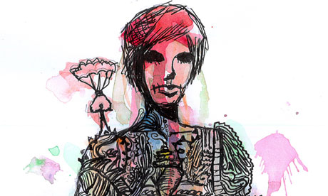
Observing the morning of acute, appreciative and unbossy judging, I could see there was one cover no one had dismissed. It had been glanced at with approval and now seemed quietly to be waiting for the judges to return to it. This was an image that seemed to contain the entire novel within a single figure. Its black eyes had no whites. Schoolboys ran amok along one of its sleeves. It had an ornamental pig codpiece. There was nothing as obvious as blood on its hands. It was a beautiful, authoritative image by 15-year-old Amy Baxter. The judges looked at it again and agreed: they'd got their winner.
Judy Golding said the "big thing", aside from skilful drawing and wit, was that the winner had been able to grasp the "complexities" of the novel and "portray those disparate elements clearly and confidently avoiding the obvious - that is tremendous". She added: "I suspect it takes courage." Eleanor Crow described the cover as "attractive yet menacing" and suggestive "both of the tropical island and the beast within".
She praised the "sophisticated" device of "containing all the elements of narrative within a single figure, whilst the colour explodes out of the drawing in a more anarchic way". Neil Gower commented on the face itself: "It is sensuous and charismatic – I love that. The artist had the maturity and skill to leave parts of the figure undrawn while still imbuing him with an unsettling, poised assurance."
Kate Abbott relished its unity – and its detail: "the snakish vines winding down one arm; the troop of boys on the other forearm; the parachutist on the shoulder … it is a quietly disturbing design but affecting and appealing." If the book had landed on her desk when she was at school, she would, she said, have been "intrigued and stunned".
I rang Amy, a pupil at North London Collegiate school, to congratulate her. And she told me, delightedly, she had entered the competition under her own steam, having picked up a leaflet from the library. "I wanted the face not to represent a single boy but the whole image to be about the beast …" She has no vision of herself as becoming an artist. But she describes herself as a "perfectionist". She studied the novel at school and found it "fascinating because it has so many layers – and I love psychology and the way the novel shows the beast within".
At one point, Judy Golding told us how much her father minded about covers, always gravitating towards draftsmanship (he was a keen amateur artist himself). There seems no doubt that William Golding would have approved of Amy Baxter's extraordinary picture.
• Lord of the Files Cover Competition at Guardian Gallery, King's Place, 90 York Way, London N1 9GU until 29 Feb
