
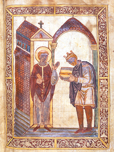
Contrary to popular belief, medieval artists had thousands of recipes for colour mixing to overcome the absence of pigments such as green. But mineral-based pigments degrade, hence the faces of these two revered figures, which are blackened by pollution from coal fires. Photograph: Black Dog Publishing
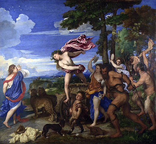
Ultramarine had been used for hundreds of years throughout the Middle East and Asia by the time it reached Europe in the 13th century. It is derived from lapis lazuli, and was so rare and expensive that it became associated with sacred subjects, particularly the Virgin Mary. Titian was one of the artists who began to use it more widely in the 16th century. Photograph: Getty Images
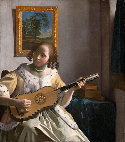
Lead-tin yellow is a lemon-coloured pigment obtained by heating lead and tin at temperatures of up to 800° centigrade. Synthesised since the 13th century, it was a mainstay in the work of Vermeer, who used it mainly to colour flowing fabrics.
Photograph: Alamy Photograph: PR
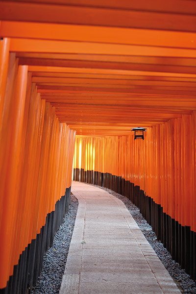
Vermillion comes from cinnebar, a deep red ore of mercury, and has been prized through the ages for its royal hue. This deeply toxic pigment was one of the first to be produced synthetically, a process that had travelled from the Orient to the west by the 12th century. In this Shinto shrine dedicated to Inari, the god of rice (and by extension, wealth), a vermillion tunnel takes you around hills and back. Photograph: Kim Unertl/Black Dog Publishing
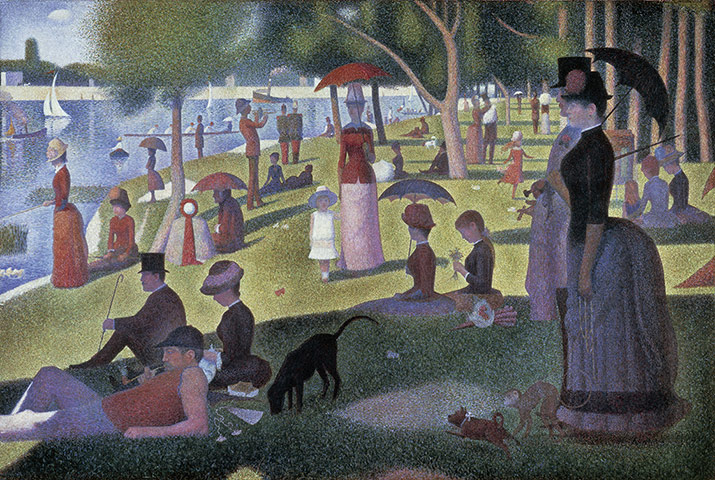
Seurat went to great lengths to create a vivid effect in his work, through his use of colour theory and his pioneering pointillism. His works have suffered from his liberal use of zinc yellow – a pigment developed from lead chromate, which had been synthesised by the French chemist Nicolas Louis Veuquelin in the late 18th century. Seurat's paintings had to be retouched even during his lifetime as the bright greenish-yellow darkened to brown. Photograph: DEA Picture Library/De Agostini/Getty Images
The Lumière brothers' Autochrome was the first commercially successful colour photography method, and consisted of a screen plate filter covered in a microscopic mosaic of potato starch particles dyed red, green and blue. This was known as the 'additive' colour model, in which a colour palette was created by overlapping beams of light in the the three primary colours. Photograph: Odile Donis/Black Dog Publishing
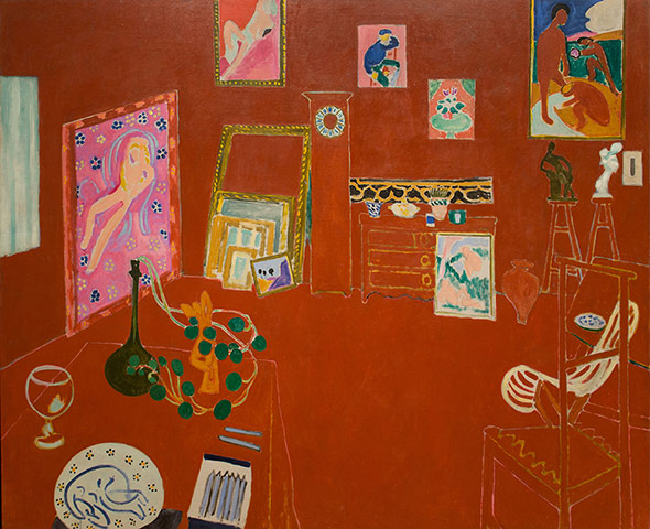
Along with Van Gogh, Matisse worked to liberate colour from its natural referents. In this painting, a saturated red creates a flat colour field with its own spatial rules. Art critic John Russell regards The Red Studio as 'a crucial moment in the history of painting... colour is on top'. Photograph: Alamy
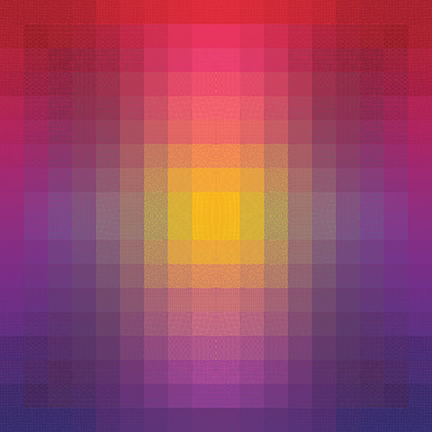
Parraman's prints demonstrate the ongoing fascination with the illusory properties of colour by using different patterns to create different tones. She writes: 'The prints also change according to viewing distance: isoluminant colours appear to vibrate and dazzle close up, but far away the image appears grey and desaturated.' Photograph: Courtesy the artist/Black Dog Publishing
Color Jam was Chicago's largest-ever public art installation, in which Stockholder camouflaged one of the city's busiest intersections with 76,000 sq ft of adhesive vinyl in a patchwork of green, orange and blue. Photograph: Courtesy the artist and Mitchell-Innes & Nash/Black Dog Publishing
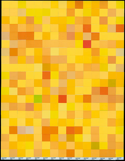
This London-based husband and wife duo asked members of the public to select the shades from the 2,700-strong Pantone range that they felt best represented a series of colours. The swatches were compiled on aluminium sheets to create 'monochromes' representing the public perception of colours. Photograph: Rob and Nick Carter/Black Dog Publishing
Falle works with the vector-based software Adobe Illustrator, building up a composite image from blends of colour and fills, to create the illusion of translucency and texture. He has described the difference between Adobe Illustrator and Photoshop as akin to the one between Lego and clay: it allows him to build colour in blocks. Photograph: Courtesy the artist/Black Dog Publishing
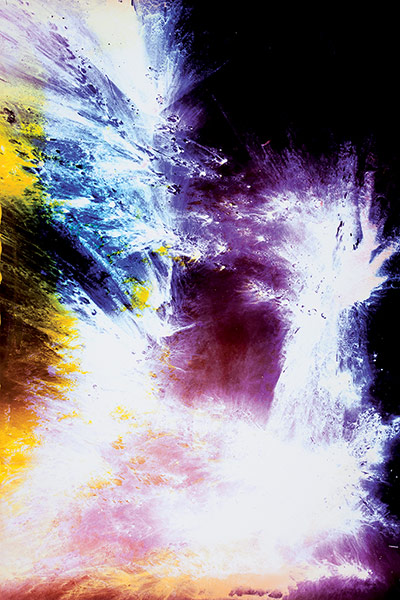
This series uses lycopodium powder – a flammable yellow substance made from the dried spores of clubmoss plants – on coloured photographic paper to create abstract shapes and textures as they combust in a dark room. The spores are mildly explosive and were used in early photography as flash powder. Photograph: Courtesy the artist and Ancient & Modern, London/Black Dog Publishing
