
Here's a treat for fans of well-designed covers, a video of Faber's Neil Gower talking about his work on the Lord Of The Flies:
Since re-designing that 50th anniversary edition of Golding's breakthrough novel, Gower has also steadily been working through the complete series of Goldings as Faber re-releases them. He has also worked on The Spire and I emailed him a few quick questions about his thoughts on the design process - and the way the book itself struck him. His answers were so interesting that I here include them in full, unedited.
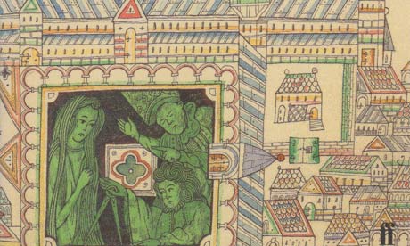
With regard to the design I wanted to convey a sense of period and the frailty of the structure. Fortunately, the spindly and uncertain linework of drawings of the time allowed me to convey both very neatly. The three figures enclosed in the 'courtyard' of the plan represent Jocelin, Mason and Goody and thereby the three forces of faith, practicality and sexual attraction that eddy through the narrative. I also like to add some enigmatic detail that only explains itself as the reader progresses through the story and I was pleased to incorporate the Nail (in its dotted frame) hovering above the pinnacle of the Spire itself. In the book Jocelin hammered it into wood where it served no structural purpose. This seemed very succinctly to represent the triumph of faith over reason, faith both in the physical ability of the Spire to stay standing and, indeed, in a spiritual God.
It's difficult when reading a book in order to design a cover to react in a way that's not coloured by over-attention to detail and imagery. Consequently, my main reaction was one of awe at how skilfully Golding had put the book together, itself a complex structure of inter-dependent metaphors, meanings, images and characters. It is a while since I read it, but I suppose the questions it made me ask myself concerned personal ambition and faith in ideas/situations that might prove baseless. I found it hard to shake off the conviction that Golding himself must, at many points, have seen the creation of the novel as his Spire, having to silence his own doubts as to its validity and integrity.
The other thing I recall being struck by was the repeated comparisons of the cathedral with the human body – the obvious phallic spire, the "stretching and collapsing" ribs (as if breathing) etc. Even (and I may well be reading too much into it now) the 'Nail' driven stubbornly in as if to grasp and fasten onto something.
I especially like the idea that Golding must have seen the creation of the novel as his spire. That's something we can possibly put to Golding's daughter and biographer Judy Carver on our webchat on 26 April . I've also read that Judy has final approval on all Neil Gower's designs, so make sure to ask about that too.
In the meantime, enjoy this quick slideshow of earlier covers for The Spire, leading up to Gower's own version, alongside a first edition of The Lord Of The Flies, and a few images of the great man himself, and his Old Testament beard.
