
It's not enough for visualisations to string the correct numbers together, they should - in the words of William Morris - be beautiful and useful.
And one of the leading experts in making data beautiful is Alberto Cairo - who teaches information graphics and visualisation at the University of Miami's School of Communication.
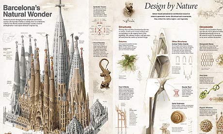
His latest book, The Functional Art, is a comprehensive guide not only to how to do it; but how to get it right, too. And, if you're interested in data visualisation, you must not only read this but absorb each of the lessons he teaches so patiently.
It's worth checking out, even if producing charts is not your day job. Cairo explains patiently why a bar chart is superior to a bubble chart, for example, or how to use colour.
Cairo is not a big fan of circles - and gives numerous reasons why: "you want readers to compare areas, but they tend to compare heights". Simpler is often better and clearer.
It comes with a DVD - which is worth watching for an analysis of Guardian America's gay rights interactive.
If you're interested in his work, you can find out more at Visualopolis and the site for his new book.
Buy The Functional Art at the Guardian Bookshop
NEW! Buy our book
• Facts are Sacred: the power of data (on Kindle)
More open data
Data journalism and data visualisations from the Guardian
World government data
• Search the world's government data with our gateway
Development and aid data
• Search the world's global development data with our gateway
Can you do something with this data?
• Flickr Please post your visualisations and mash-ups on our Flickr group
• Contact us at data@guardian.co.uk
• Get the A-Z of data
• More at the Datastore directory
• Follow us on Twitter
• Like us on Facebook
